Tuesday, May 4, 2010

Site: Wollstonecraft, Sydney

Especially in terms of my concept, the site is an extremely critical element. With the basic idea of my model consisting of two major spaces, one being boring and repetitive whilst the the other is bright and exciting. This meant that my site needed to capture both of these extremes. Many different locations ran through my head, but none successfully portrayed these two feelings at the same time. I wanted my site to be somewhere I had experienced personally so I could properly relate to how it felt being engrossed in that particular site. This meant being in Sydney as it is where I have grown up and lived my entire life. I eventually decided to located my site exactly where I live. I live just on the North side of the Harbour Bridge in an apartment located on the end of the building. The best part about this is that we have views from three sides. Due to my model only having two spaces I only needed to focus on two of these views. One side looks out directly over the harbour and the city skyline, while the exact opposite side looks at a main road and a row of more apartment blocks. This means that the dull side is constantly shaded and noisy with nothing much interesting to look at. However the other side is the complete opposite. No matter what time of day it is there is a nice view and you are always noticing something different about it. This seemed to portray exactly what I wanted and was literally on my doorstep.

Another fantastic element of this site is quality source of light. Depending what time of the day it is, the light flows in from all different directions. Early on it is shadowed by the surrounding buildings making one side of the apartment dark and cold. However once the sun rises higher in the sky it lights up the other side of the building into a bright and warm space.

My chosen site can be seen on the map below in the top left corner symbolised by the "A".

These images show the different views from either side of the apartment building.

You can instantly feel the contrast between each view and the effect it has on your feeling/mood.

Monday, May 3, 2010

Model Conceptualisation:

With my narrative focusing on the escape from a world of repetition, I began to sketch and research repetition in architecture. Many people use this to their advantage in design, whilst in some cases it is seen to be boring and lacking creativity. For my model I wanted to encapsulate this repetition, creating a space that was bland, with dull lighting and lacking flair. I then wanted to focus on the transition into a space that was vibrant, bright and exciting. With nothing being quite the same and abstractions throughout the space. I believe this has a large effect on people's feelings and how their mood can change depending on the space/environment they are in.

Relating it back to "New York Movie", the woman in the painting would be trapped in the bland space of repetition. Wanting nothing more than to break away and into the warmth of the space she desires.

These quick sketches further outline the concept for my model:

Narrative & Analysis:

"Escaping from a world of repetition."

After analysing this painting the idea for a narrative became quite obvious. The majority of information found reviewing this piece of art mentioned the woman caught somewhere she clearly didn't want to be, and was counting down the hours until she could leave. A lot of emphasis was put on the theatre, and how she would have stood in that exact same spot with the exact same movie playing in the background over and over again, wanting nothing more than to escape. Having to usher in the same kind of people each session, her life had simply become a monotonous repetition.

Edward Hopper:

Born on 22nd of July 1882, Hopper is an American realist painter and printmaker. He was most famous for his oil paintings reflecting his personal vision of modern American life. Hopper died on may 15, 1967. In his work he paid particular attention to geometrical design and the careful placement of human figures in proper balance with their environment. The effective use of light and shadows to create the desired mood are also central to Hopper's style. The solitary figures of his art are mostly women often reading, looking out a window or in their workplace environment. He used to sum up his artwork by stating, "The whole answer is there on the canvas".

References:
http://en.wikipedia.org/wiki/Edward_Hopper
http://www.ibiblio.org/wm/paint/auth/hopper/hopper.self-portrait.jpg

Tuesday, April 13, 2010

Edward Hopper: New York Movie (1939)


The painting I have chosen for Project 2 can be seen above. It is one of the more famous paintings by Edward Hopper called "New York Movie".

After researching this particular painting and learning about others in our Studio class it became clear to me that the people in Hopper's art live in an outer world of little comfort, but still clearly have their own inner lives and issues. The woman in this painting is simply gazing into nothingness, absorbed in her own thoughts.

Hopper uses composition and a layered disposition of reality to make the movie viewers and the woman seem to be in totally different worlds.

After researching this painting I discovered that the woman is in fact an usherette for the theatre, which tells us that she cannot leave even if she wanted to. This is reinforced by the fact that she is leaning up against the wall trying to take the weight off her feet. Almost as if she has been there for an extended period of time, but still has a while to go.

This particular painting, and the majority of Hopper's other works, draw the viewer into the head-space of the protagonist, and make us wonder exactly what they are thinking. In New York Movie the sound seems almost unwilling to her ears, like she has seen that movie over and over and is trying to escape.

Tuesday, March 30, 2010

Project 1 - Submission:

Model:


Parti:


Poche:

Final Model:

Here we can see one half of the completed model from the exterior. It shows how the building sits in relation to the site, and emphasises the cube like design that Adolf Loos was trying to achieve. As Loos mentioned the exterior gives nothing away to the complexities that lay within its walls.

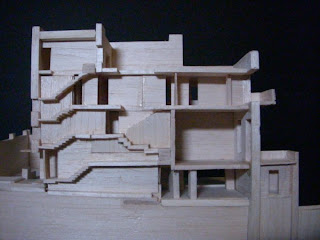
This shows the same side as above, but looks at the section plane on which we decided to cut. It shows the spacial design technique of Raumplan with its split-levels. It also shows how the earth surrounds the lower levels of the Villa.

This is the exterior of the other half of our model. Once again the cube like design of Loos is easily identified along with its relationship to the site. As a group we were very happy with the way the exterior came out. Our tutor mentioned that the most successful models did not draw the viewers attention to edges and joins, and we believe our exterior is both smooth and flowing, with no unnecessary lines that draw the observers attention away from the overall structure.

The interior of our model we believe was equally successful. This image shows the second half of the model, including all walls and rooms. Our decision to cut the model through the main stairs proved to be a rewarding one, with an aesthetically appealing final product.

The model was overall quite a challenging task. As an Architectural Computing student model making isn't exactly our expertise, but it was good to have the practice and study a new building. It also tested our skills when working with other students which is always a worthy exercise.

Final Poche Rendering:

Here you can see my final Poche Renderings for both the section and the plan. I have focused on human interaction within the spaces. I have shaded the access areas for the Villa's occupants. This shows the zones which will have the highest levels of movement.

Final Parti Diagram:

For the Parti Diagrams I chose to focus on the circulation of the Villa, as well as its geometry. The section Parti (much like my Poche) shows the movement throughout the building via its main access areas. The plan Parti has tried to show the structural elements of the building and its main geometry. This was difficult as it has multiple split levels, so only the main supporting members were drawn in.

Model Progress:

These images show our model in the early phases of construction, around Weeks two and three. Each member of the group was responsible for a different facade, and these images show them all coming together.

We decided to make our section cut through the main set of stairs in the Villa. Not only was this very close to the actual centre of the building, but we thought that having half the stairs on each section would make for the most appealing model.

We also decided that the site was an essential part of the building, and that it was necessary to be included in the model. Unlike other Villa's, the Villa Muller is actually a part of its surroundings, with certain levels underground and the landscape accentuating the buildings presence on the overall site.

Here we can see the progress around Week 4. The interior is beginning to be pieced together. Different group members worked on each side of the interior, whilst other group members worked on the site and roof.

We were unsure whether or not to exclude certain walls that would not be seen when the model was completed. But to make sure that it was as accurate as possible, and in order to get a true 'feeling' for the building when we were constructing it, we opted to model each and every room and wall.

Poche Exploration:

Poche renderings show the scale of a room in relation to a human. Proportion and texture of spaces. They portray the tangible spacial quality, the ambiance and human interaction. It is an experimental configuration about how a space makes you feel.

These images show some examples of Poche renderings, some are of the Muller Villa by Adolf Loos. They show both sections and plan views. I observed many different sketches such as these while trying to fully understand the concept of Poche. Some of my study notes for Poche included...
  • Make it about the architect, how they were trying to make you feel.
  • Flow and experience.
  • Look real, leap out at your, show textures.
  • Lots of shading which shows the flow of light.
  • Vegetation, furniture, light fittings.
  • Ambiance.


Here are images of my own Poche Rendering exploration:

These initial Poche Renderings are trying to blacken the solid parts of the plan to indicate the thickness of the building envelope.

Parti Exploration:

Is like a diagram (party line). Outlines the essence of spacial organisation of a building plan. Helps understand the building as a pattern. The scheme which gives it its tangible form, yet it is elastic and beyond "shapes and dimensions". It is an instrumental configuration.

Overall I found the concept of Parti much harder to grasp than Poche. Trying to find the essential minimum of a buildings design proved to be quite difficult. This seemed to be common in my tutorial group with many students struggling to grasp the concept. Shown below are a few examples of Parti Diagrams that I found during my exploration of the concept, along with some study notes from our tutorials.
  • What sticks in your head after you leave, the overwhelming factor.
  • Spacial organisation.
  • Primary spaces and how they fit together.
  • Look for internal symmetry.
  • The essential minimum of the design.
  • Crux of the building.
  • Parti can be shapeless and unrecognisable.
  • The primary idea, cut it down.
  • Enclosure, Structure, Circulation, Geometry.


Here are images of my own Parti Diagram exploration:

These images are trying to show the development of my final Parti Diagram. Starting at the beginning of the session, all the way through to submission.

Geometry:

Circulation:

Enclosure:

Structure:

Adolf Loos - Villa Muller:

The Villa Muller is an architectural structure designed in 1930 by architect Adolf Loos. The Villa is located in the Czech Republic's capital city Prague, and has become an innovative landmark of early modernist architecture. The spacial design know as 'Raumplan' is evident in the multi-level facets of individual rooms, indicating their function and symbolic importance. This design can also be seen on the exterior of the building.

"My architecture is not conceived in plans, but in spaces (cubes). I do not design floor plans, facades, sections. I design spaces. For me, there is no ground floor, first floor, etc. For me, there are only contiguous, continual spaces, rooms, anterooms, terraces, etc. Storeys merge and spaces relate to each other."

While others, like Frank Lloyd Wright were attempting to perfect the seamless transition from interior to exterior, Loos was deliberately keeping the public outside and the inside private. His aim was to make the building seem "dumb" on the outside, and only reveal its true wealth on the inside.

The first entry way to the Villa is low, which opens up into a cloakroom area that is generous in space. At the far end a short, modest staircase takes the visitor round a right-angled bend, emerging between marble pillars into the double-height sitting room. The Villa Muller was comprehensively restored in 2000 and is now open to the public as part of the City of Prague Museum.


References:

http://www.galinsky.com/buildings/villamueller/index.htm
http://en.wikipedia.org/wiki/Villa_Muller
The aforementioned quote is a shorthand record of conversation from Adolf Loos in 1930.