Monday, June 7, 2010

Project 3 - Submission:

Final Sectional Model:


Site Plan:


Floor Plans:


Sections:


Renders:


Interior Perspective Vignettes:

Model Development:

These images show a timeline of my gallery from conception through to a full 1:100 scale model.

I chose to take the section through the courtyard, as this is the space that divides the gallery. From the courtyard forward towards the atrium on the lower level is all public space, whereas from the courtyard backwards is the offices and workshop areas. These spaces are restricted to employees of the gallery only. I also chose to take the section through the courtyard as I want to give it an "outdoor feel", hence the glass roof. Opening it up through a section adds to this idea that you could in fact be outside.


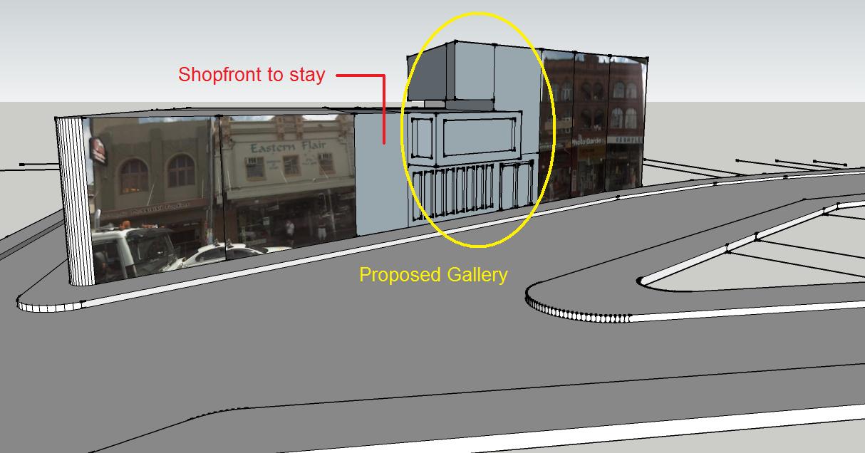
Getting the front facade right with the intertwining levels and the different angles was the hardest part of the model making process.

I decided to make the roof detachable so that you could get a good look at the inside of the gallery and see all the different rooms and spaces. If the roof was a permanent fixture you would not be able to appreciate the gallery for what it is.

The top story is the apartment space for the client, it also includes a living area and a catering prepared kitchen for gallery functions. I decided to make this separate to the majority of the gallery as it is portrays more of a homely feel. I didn't want my gallery to have kitchens and living spaces scattered in with gallery spaces and viewing rooms.


I think that I managed to successfully achieve the desired aim from my front facade.

With other buildings on either side of the gallery there was no need for windows etc down the sides. This does tend to make the model look a little plain, but I think once it is placed on the site you will able to truly appreciate it.

Finally, here is the model almost entirely completed. As there are multiple pieces to my model, the largest front section has been stuck to a base so that it stays relatively sturdy. I didn't want to risk having too many loose pieces when transporting it to Uni, or when displaying it.

Parti/Poche Exploration:


Even though I decided that using computer design software would be more successful for my gallery than hand drawings, I still thought it would be important to include some. These images try to capture the main shapes of the structure and how they fit in with one another. It also shows the separation that the courtyard provides, and the way the second story is connected but almost like a recluse from the main gallery at the same time. The windows in the front atrium work to create casting shadows through the front space, and will constantly change as the day progresses.

Narrative Exploration:

Character of the Gallery Owner:

Newtown is notoriously known for its savvy "out there" fashion, and for being almost riskily alternative. For this reason I think it is important for this style to be exhibited in the gallery owner. It almost seems that Newtown expresses fashions before they become fashionable.
The quirkyness of Newtown needs to be within the gallery owner so that their personality not only fits in with the gallery, but the immediate surrounds of the gallery. This will also appeal to the general public and draw them back to the gallery time and time again. The owner needs to be relatively young to fit in with the demographic of Newtown, while being lively, enthusiastic and knowledgeable about the art being displayed. The owner also needs to be constantly on the lookout for new and exciting projects that could be utilised in the gallery. The top story of the gallery (or living space) gives the owner an escape from the gallery should they want it, and an area that they are free to do what they wish with. I can imagine that the Newtown personality could sometimes become overwhelming, so even though the owner must embrace it, they have a escape should it be necessary.

Character/Personality of the Gallery:

Newtown was recently dubbed as "Sydney's most creatively well endowed suburb", yet it still manages to fly under the major tourist radar. One thing you have got to keep in mind is that while Newtown is by far the most Bohemian district of Sydney, it is different from Bohemian communities in other parts of the world. This is Australia after all, and the Australian personality still shines through, perhaps even more forcefully than in any suburbs.
This gallery must have a similar personality to that of the owner. They must work together in a way that one could not work without the other. Although I want it to blend in with its surroundings, it still needs to have an independent personality of its own. This will be the defining factor that makes it stand out from being just any other gallery. Due to its overall size and reinforced by its large street overhang I think its grandeur and presence will be unquestionable. This will be a large source of providing interest and curiosity to the people of Newtown.

Art to be Exhibited:

Newtown has long been home to large numbers of visual artists and writers. In the 80's it was the hub of independent music, and now it has become the cradle for the performing arts, actively nurturing young playwrights, actors and dancers. The area is literally littered with performing theatres and venues. My gallery hopes to take advantage of this local talent by exhibiting their work. Photography is very popular form of art in Newtown, both of the local street art and the people that occupy it. This is what I would like to express in my smaller galleries, possibly advertising them for sale giving the artists a way to get appreciation and a return for their work. The larger gallery will be used to express works like larger paintings, and even larger photography. All of these galleries will be used simply for wall mounted art work. Three dimensional art such as sculptures will be displayed in the courtyard. I don't really want to place a restriction of the style of work that is displayed in the space, so it will include not only sculptures but abstract models as well.

Established Narrative:

"Expressing its individuality through conformity."

Yes this narrative contradicts itself, but I wanted to express how the gallery fits in with the Newtown society, yet stands out through its personality at the same time. At initial glance you are drawn to the gallery through the intertwining levels and blocks, but once you enter you realise the gallery displays art from the people of Newtown. Encapsulating the "vibe" of Newtown in one single building.

Sunday, June 6, 2010

Revit Development:


This image shows the development of my gallery in Revit. This is the front (or street) facade. You can see how I have tried to employ the different intertwining levels like the researched architecture by Zaha Hadid. The front atrium is two levels high with large front windows maximising light exposure and give a sense of grandeur as you walk in off the street. The front door hasn't been covered on purpose to draw attention to the entrance and once again add to the grandeur of the gallery. The top story will be the living quarters for the gallery owner, working as an escape from the public. This image gives you a small glimpse off the staircase and front reception/atrium space through the glass windows and doors.


This image shows the rear of the gallery, this is what would be seen from the access laneway. There is a large roller door for transporting artwork in and out of the gallery. The workspace and storage at the rear of the building is also quite large to allow easy access to the courtyard for the sculptures. The door provides access to the office spaces so that employees don't have to constantly flow through the atrium should there be a function on. A small roof has also been installed on the rear of the building to provide some protection from the elements. The top level looks very intertwined when viewed from the street, but from this angle it looks to be almost the same block as the rest of the building. This is due to the angular glass roof over the courtyard, which is shaped to utilise maximum sunlight. Originally I thought I would keep the courtyard roofless to give it a real outdoor feel, however as the courtyard provides access to office spaces and the workshop I decided that it should be covered. This would also offer protection to the outdoor artwork and allow access to patrons even in poor weather.

Saturday, June 5, 2010

Revit Architecture Exploration:


After quickly modelling up the outline of my proposed gallery in SketchUp I decided that AutoDesk's Revit Architecture would be a more appropriate program to model the gallery. Mainly due to the site plan, floor plans, and interior images that need to be produced for submission. Revit is much more capable of creating these plans and has larger capabilities for interior layouts.

The image above shows some sample layouts for the ground floor of the gallery. They incorporate the front atrium with a reception area, along with large and small gallery spaces, a courtyard for sculptures and workshop/storage spaces.

The second level is going to have the small bed-sit apartment with a bathroom for the gallery curator, as well as kitchen facilities to cater for gallery functions.

Tuesday, June 1, 2010

SketchUp Development:


Being an architectural computing student I decided to begin modelling the site and gallery in a relatively easy 3D modelling program called Google SketchUp. This will allow a great deal of flexibility when it comes to idea concepts and making changes. It also helps to give an idea of scale, and what the gallery will look like from different parts of King Street.


I added the image of neighbouring buildings, once again to give an idea of what the gallery will look like in its King Street environment. With the very unique Victorian style that is prevalent in King Street a contemporary art gallery may seem somewhat out of place. However I think this could work to the gallery's advantage, and by modelling it up in SketchUp I aim to find this out.


This shows a quick mock-up of my designed outlined below and how it would look in relation to the buildings either side. The intertwined stories work to step down from the higher building to the lower level building. Due to the restrictions outlined in the brief I have chosen to keep one of the shops in place. This means that rather than having gaps around the gallery because it doesn't completely fill the site, one shopfront can remain and the gallery can consume the remainder of the site.

Site Model:


These images show the model created for Site 3. This is to establish the direct surroundings of the gallery and how it will sit in the context of its environment. It will be used to establish levels of neighbouring buildings and how the gallery will interact with the available space on the site.

Conceptual Sketches:


Part of the criticism with my previous two assignments was the clean-cut lines of my sketches. My poche renderings seemed almost like site plans with lines being solid and hard. I find it difficult to portray three dimensions in my sketches so I had some practice with the original building on site three before I set about designing my gallery. As an architectural computing student I do tend to neglect the hand drawing side of design. This studio class has opened my eyes to how critical quick sketches can be.

Currently I am torn between modelling my gallery up using computer software, or sticking with hand drawing. I think a quick Google SketchUp or AutoDesk Revit model could give much more insight into what I am trying to achieve with my gallery than my hand sketches could.


These initial conceptual sketches have been inspired through some simple axonometric shapes drawn from some of my inspirational galleries. I've tried to capture the front facade with the thick sidewalk overhang protruding into the path of pedestrians and capturing their attention. The living space on the second level is supposed to give the effect that it is separate to the gallery spaces, yet still intertwined with body of the building. The second story will not extend all the way back as the courtyard needs direct sunlight. My vision involves lots of glass with gallery viewing from all different angles. I am also torn whether or not to include public spaces on the second level.

Monday, May 31, 2010

Inspirational Galleries:

A major factor is the design of a successful art gallery is the roof structure. Art is best viewed with diffused natural light. Direct sunlight can not only deteriorate the quality of the artwork, but can cause awkward shadows and glare throughout the gallery. Architects have many different ways in which they disturb the flow of natural light coming into their galleries for the best viewing experience.


1 & 5. - Kimbell Art Museum by Louis Kahn
Natural light enters through narrow plexiglass skylights along the top of cycloid barrel vaults and is diffused by wing-shaped pierced-aluminum reflectors that hang below, giving a silvery gleam to the smooth, concrete-vault surfaces and providing a perfect, subtly fluctuating illumination for the works of art.
2. - Design by Louis Kahn
Works much like the Kimbell Art Museum, but also includes smaller louvers on the barrel vaults.
3. - Parrish Art Museum by Herzog de Meuron
Consists of a long corrugated metal roof structure running at steep angles with scattered skylights. These openings bring natural light into the gallery spaces in a much simpler way to the other inspirational galleries, yet is it still greatly successful.
4. - Rome Museum by Zaha Hadid
This gallery uses louvered ceiling panels that open and close automatically with the daily movement of the sun.
6. - Fondation Beyeler Gallery, Riehen Switzerland by Renzo Piano

This gridded ceiling is glazed throughout the building, providing indirect natural light in all the galleries. The simple elegance and detailing of the lit ceilings hides a five-foot space above, in which electrically controlled louvers, artificial lighting and the roof of brise-soleil are used to control the light in the galleries. At the building ends the glass roof extends generously beyond the glass walls and a further row of pillars, over the reflecting pool and the real-life water-lilies outside.


In one of our tutorials we were shown the Centre Of Contemporary Art in Rome by Zaha Hadid. I had never seen this piece of architecture before, but I was instantly drawn to it. Especially the way in which it overlapped itself and gave the sense of flowing spaces. The main aspect of the architecture that appealed to me was the large overhang at the front of the building with a glass facade. It seemed like a simple yet prominent feature of the design and something that I would like to incorporate in my own gallery.

The centre is made up of spaces that flow freely and unexpectedly between interior and exterior,
where walls twist to become floors or ceilings. The building absorbs the landscape structures, dynamizes them and gives them back to the urban environment. Hadid's architecture can thus be understood as an intensification of the surrounding space.

'a scene for thought, with art as a player on the scene' is Hadid's narrative for the centre.


Another piece of work by Zaha Hadid which I came across when studying the Centre in Rome is the Centre Of Contemporary Art in Cincinnati, Ohio. It does not flow like her architecture in Rome, but it does utilise the idea of intertwining sections/blocks that appeals to me. I also like the way it stands out from its neighbouring buildings, like it is a piece of art in itself, on display for motorists and pedestrians as they travel past.

"The concrete, steel and glass building features undulating levels and ramps to accommodate the varied shapes, scales and media of contemporary art. The galleries, that appear to float over the main lobby, connect and interlock like a three dimensional jigsaw puzzle, allowing for unobstructed viewing from all sides." This quote from the inauguration of the building identifies the elements that I would like to capture in my gallery design.


This gallery was another form of inspiration for me, once again due to the large overhang you can see in the bottom left of the image. I really hope that I can capture this element in my own gallery design. As well as providing seamless connections between the elements of the museum, the atrium can accommodate 1800 guests for receptions. Because art galleries are no longer just about art, they have to engage with the city, and according to some they are part of the entertainment industry. The internal cladding is coated aluminium that folds with the crispness of origami. For all the geometry there is a sense of calm throughout, especially in the understated form-follows-function galleries. In the new building the architects have designed big flexible spaces for big modern works. Backstage there is none of the usual diminution in quality one comes to expect in arts buildings. In fact the storage area was designed so it could easily be converted into gallery space. Architecture by no means has to be iconic, but if it is to work as an icon then it has to go for it, as this does. The architects have responded to the client's desire for a building that announces itself to and embraces the city in which it is situated.

Further Site Exploration:

My initial site exploration simply considers which site would be the most appropriate for my gallery and shows images of it from the street. A deeper analysis of this site can be seen below through the use of maps and satellite images.

This first image shows a simple Google map of the site, with the location of the gallery represented by the "A" bubble. This gives you an idea of address boundaries, main streets, back streets, and access routes.

This image is the same as the one above, but takes advantage of the satellite option utilised by Google. I found this to be a much more informative image as the realism helps you relate better with the location.

This final image has removed all of the labels and street names to make way for some simple highlighting of the major site categories.

Yellow - highlights the boundaries of King Street itself. This is the common feature of all the three sites and is critical to the outcome of the gallery.
Red - shows the surrounding streets that link onto King Street and flow traffic to the main thoroughfare.
Blue - shows the outline of site three which has been chosen for my gallery.
Green - the neighbouring sites are very influential to the constraints of the proposed gallery so they have been highlighted to show their importance.
Purple - highlights the major flow of pedestrians that are constantly perusing the cafes and shops that line King Street.


This image is a modified version of the DWG file uploaded for us on Blackboard. After adjusting the scale correctly I used it to establish the site measurements (as seen on the image). However the site is larger than the constraints outlined in the brief. We are restricted to a maximum width of 12m and length of 30m. The shop fronts on King Street are usually edge to edge with no gaps in-between. This means that if the site is not completely filled by the gallery then it may look out of place. Measures will have to be taken in order to solve this problem.

King Street, Newtown:

King Street is today the central thoroughfare of the suburb of Newtown in Sydney, New South Wales. It's in this street that the residents of the area are most visible, confirming Newtown's reputation as a cosmopolitan community with a higher than average concentration of students, homosexuals and those with an artistic twist who tend to dress with colourful flair. The street can be divided geographically into two sections, North and South. King Street is particularly notable for the many picturesque Victorian and Edwardian era shops and other buildings that line the street. King street is believed to follow the line of ancient Aboriginal track that led from the Sydney Cove area south-west across to Botany Bay. It has also become quite residential above the shops including a large number of apartments. It is known as the best preserved Victorian era street in Sydney and development controls ensure that it will not change. What was once considered too unfashionable to be worth developing is now a sacred part of Sydney.

North King Street, running east-north-east to west-south-west between the University of Sydney, past Newtown railway station at the junction with Enmore Road, is the stretch that most people associate with King Street. This area is a very busy thoroughfare, with traffic jams that rule rather than the exception, heavy foot traffic, and a profusion of restaurants, cafes and fashion retailers.

South King Street was by contrast the down-market section, with less traffic and fewer retailers, running southwards from the station to Sydney Park. In recent years, the far northern section seems to have lost most of its lustre, while the central section has become almost glamorous, and South King Street has attracted a cluster of design shops and homewares shops, which along with assorted small quirky businesses and cafes, has made it one of the most interesting strips in Sydney. It is sometimes referred to as the "Paris end" of King Street.

References:

  • Information on King Street from WikiPedia
  • Image from Google Images

Sunday, May 30, 2010

Project 3 - Site Exploration:


This image shows the layout of the three possible sites along King Street in Newtown, Sydney. Each site has its pros and cons for the location of a gallery, but after considering each I decided to make 'Site 3' the home for my design.

My initial gut feeling drew me to Site 2, mainly due to its level of exposure and the sites ability to utilise three separate facades. This meant that the gallery could almost become part of the art itself. Being able to utilise the building to express what it holds within its walls would be a very successful element to a gallery. I was however turned away from this site as its practicality for a gallery wasn't as superior as what Site 3 had to offer. In my opinion Site 1 didn't offer the specifications for a successful gallery at all. We were told to focus on levels if we chose this site, but in my opinion a gallery needs to be noticed from the street with attractive street sidewalk frontage and excessive amounts of stairs was not in my original vision. Site 3 seemed to offer the best mix of all these elements. It had generous street frontage along with a great lane-way for alternate entry that I thought that would be perfect for a gallery. This meant that deliveries could be bought in through the rear entrance and it allowed an entry/exit for the gallery owner without having to constantly use to main street access.


The above picture shows a montage of images from the site that I have chosen for my proposed gallery. You can see the generous street frontage available as well as the rear lane access. These images also give an idea of what the surrounding buildings look like, their height, and the "vibe" the area gives pedestrians and motorists. I believe this site has great potential to be the location for an art gallery specialising in contemporary and experimental artworks.